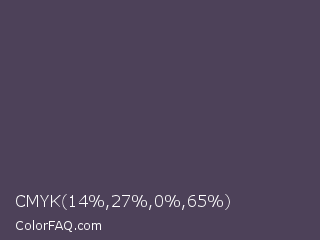
CMYK 14,27,0,65 Color Codes
CMYK 14,27,0,65 Color Space Converter
CMYK 14,27,0,65 Nearest Colors
Mortar
Mulled Wine
English Violet
Gun Powder
Purple Taupe
Quartz
Mako
Trout
Abbey
Gravel
Voodoo
River Bed
Dark Liver
Emperor
Dark Byzantium
Bright Gray
CMYK 14,27,0,65 Color Information
 CMYK 14,27,0,65 Color is a dark violet color and the nearest color is Mortar #504351. Hex code #4d4159 and RGB value is rgb(77,65,89). In RGB color space, this color is composed of 30% red, 25% green, 35% blue, In CMYK color space, this color is composed of 14% cyan, 27% magenta, 0% yellow , 65% black , In HSL color space, this color has a hue angle of 270° , 16% saturation and 30% lightness.
Color Schemes with CMYK 14,27,0,65
Complementary Color
Two colors are on opposite sides of the color wheel. This combination provides a combination of high contrast and high impact colors that will appear brighter and more prominent.
Analogous Color
Three colors side by side on the color wheel. They usually match well to create a quiet and comfortable design. Analogous color schemes are often found in nature and are harmonious and pleasing to the eye.
Split Complementary Color
This combination consists of one color and the colors on both sides of the complementary color. By including three shades, this strategy adds more variety than complementary color schemes without being too harsh or too bold.
Triadic Color
Three colors evenly distributed on the color wheel. This provides a high contrast color scheme, Triadic Color combination creates a bold, vibrant color palette.
Tetradic Color
Four colors evenly distributed on the color wheel. These color combinations are always loud and fun, and the vibrancy makes the design stand out. Tetradic color scheme is bold and works best if one color is dominant.
Monochromatic Color
This combination is different variations of a single hue. This combination consists of varying tints, shades, and tones of the chosen hue. These combinations are great for simplifying busy designs and creating a harmonious, visually appealing look.
Tint Color
Tint combination is created by adding white to the base hue to brighten the color. This can make the colors less intense and is very useful when balancing more vivid color combinations.
Shade Color
Shade combination is created by adding black to the base hue and darkening the color. This creates a deeper and richer color. The shadows can be quite dramatic and can be overpowering.
Tone Color
Tone is a hue or mixture of pure colors to which only pure gray is added (equal amounts of black and white). Adding gray to a color will make the intensity much duller.
CMYK 14,27,0,65 Color Preview
Preview Color CMYK 14,27,0,65 on Black Background
Preview Color CMYK 14,27,0,65 on White Background
CMYK 14,27,0,65 CSS Examples
Text Font Color
This text has a font color of CMYK 14,27,0,65
<p style="color:#4d4159">Text here</p>
<div style="color:rgb(77,65,89")>Text here</div>
<span style="color:hsl(270,16%,30%)">Text here</span>
Border Color
This element has a border color of CMYK 14,27,0,65
<p style="border:1px solid #4d4159">Content here</p>
<div style="border:1px solid rgb(77,65,89")>Text here</div>
<span style="border:1px solid hsl(270,16%,30%)">Text here</span>
Div Box Shadow
This element has a border shadow color of CMYK 14,27,0,65
<div style="-moz-box-shadow: 1px 1px 3px 2px #4d4159;
  -webkit-box-shadow: 1px 1px 3px 2px rgb(77,65,89);
  box-shadow: 1px 1px 3px 2px hsl(270,16%,30%);">
Text here</div>
background color
This text has a background color of CMYK 14,27,0,65
<p style="background-color:#4d4159">Text here</p>
<div style="background-color:rgb(77,65,89")>Text here</div>
<span style="background-color:hsl(270,16%,30%)">Text here</span>
Text Shadow
This text has a shadow color of CMYK 14,27,0,65
<p style="text-shadow: 3px 3px 2px #4d4159">Text here</p>
<div style="text-shadow: 3px 3px 2px rgb(77,65,89)">Text here</div>
<span style="text-shadow: 3px 3px 2px hsl(270,16%,30%)">Text here</span>
CMYK 14,27,0,65 css code
.text {color:#4d4159;}
.background {background-color:rgb(77,65,89);}
.border{ border-color:hsl(270,16%,30%);}
.textShadowRgb { text-shadow: 3px 3px 2px rgb(77,65,89); }
.textShadowHex { text-shadow: 3px 3px 2px #e74ff0; }
.textShadowHsl { text-shadow: 3px 3px 2px hsl(270,16%,30%); }
.divShadow { -moz-box-shadow: 1px 1px 3px 2px rgb(77,65,89);
  -webkit-box-shadow: 1px 1px 3px 2px #4d4159;
  box-shadow: 1px 1px 3px 2px hsl(270,16%,30%); }