Color contrast
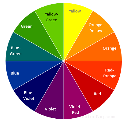
Color contrast is the contrast between one color and other different hues in addition to complementary colors. The contrast of two or more colors in the range of 90 degrees to 180 degrees on the hue circle is at a 90-degree contrast. It is a medium-to-difference color contrast. The contrast at 120 degrees is stronger than the contrast at 90 degrees.
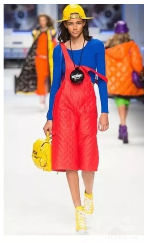
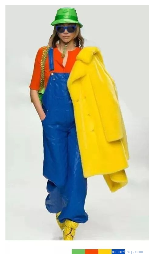
The "three primary colors" have a strong contrast, and the super-saturated three primary colors collide with each other. Whether it is for embellishment or large-area rendering, the line of sight will be naturally locked without focusing on the eyes, and it will always shine.
When the saturation of the "three primary colors" is reduced, the contrast will also weaken. Compared with the high saturation of the three primary colors, the matching is more in line with the public's aesthetics, and it is a little more advanced.
The strong contrast of "three primary colors + intermediate color green" is the same as the collocation of the three primary colors. It collides strongly and is dazzling and colorful.
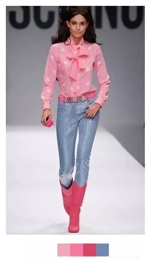
"Light red + light blue" has a weak contrast. Because a large amount of white is added to the color, the lightness is increased. Compared with the radiant high saturation color, it looks more soft and delicate, and the color is elegant and refreshing.