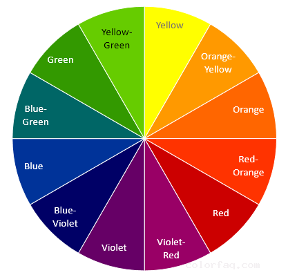
Cold and warm contrast
In fact, all the previous comparisons include the contrast between cold and warm. The "blue + orange" in the complementary color is a contrast between cold and warm. The contrast between cold and warm is relative. Red is considered to be a warm color, but red is also relatively cold, close to blue The red naturally contains blue components, so red is also warm and cold.

"Warm red + blue" creates a contrast between cold and warm
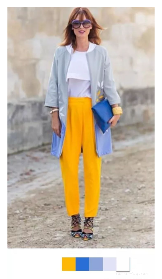
If there is one word to describe orange, it is warm! Orange is the only color in all colors that does not distinguish between cold and warm. It is an absolute warm color. Orange + blue is a contrast between cold and warm. Especially the high saturation orange and blue have a very strong contrast. The contrast of these tones is quite bold and conflicting. It's dramatic.

Warm orange + cool blue, blue balances the warm and unrestrained feeling brought by the rich warm orange.
Warm yellow + cold blue + cold gray + pure white, like adding ice to the orange juice and determined to isolate it from the hustle and bustle of yellow, it is even more refreshing.